Item picker
The item picker component allows users to browse or search through the available records to make selections.


The item picker displays when users add asset, product, classification, or product-to-classification references. The item picker is also used to customize views.
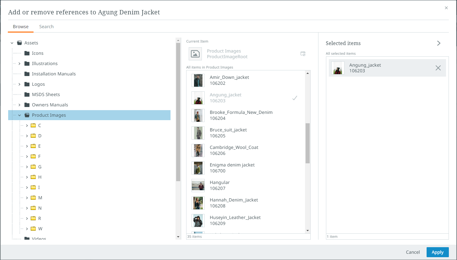
The item picker opens by default on its "Browse" tab. In the "Browse" tab, users can navigate through system objects via an expandable and collapsible hierarchy called the navigation tree.
In the "Search" tab, available in the item picker only when adding a reference to an item, users enter the desired item's name into the search bar to search for folders with items contained inside. By entering three characters into the search bar, the system presents results that align with the entered query, if present. The typeahead results will display beneath the search field, and for each result, that item's object type icon, thumbnail, name, and ID will display. For each item in the typeahead results that the user wants to reference, they must click the "+" symbol that displays at the far right of the item's list-row.

When added, the selected item's plus sign ("+") is replaced with a checkmark in the list of typeahead results. It also displays in the "Selected items" column.
If the user is, for instance, adding a reference for a single-value reference type, and an object has already been referenced and is displaying in the "Selected items" column, the objects showing in the center column will display not with a plus sign ("+") but a replace icon, as shown in the screenshot below:
![]()
Note: The "Search" tab is only available in the item picker when adding a reference to an item. It is not currently available for other use cases.
The visual elements that comprise each tab of the item picker is listed and described below.
Browse
The "Browse" tab of the item picker dialog is comprised of three vertical panels:
Tree Navigator - In this panel, the relevant hierarchy is displayed. Users navigate through the hierarchy to locate and select the desired object. The folders and objects selected from the hierarchy display in the "Selected items" panel.
Selection List - In this panel, users can see which objects are contained in folders selected in the tree navigator panel. Objects in gray text cannot be selected. Objects in black text can be selected. To select an object, hover your cursor over that object. A "+" symbol displays to the far right of the listed object. When you click the "+" button, the object is moved to the third panel.
Selected Items - The "Selected items" panel shows all selected objects relevant to the object being worked.
Search
The "Search" tab of the item picker dialog is comprised of two vertical panels:
Search and select items - At the top of this panel is the search bar. Users type their search query into this field and the typeahead results display beneath the search bar.
Selected Items - The "Selected items" panel shows all selected objects relevant to the object being worked.
To save and apply the changes made on either tab of the item picker, click the "Apply" button. To disregard any changes made in the item picker, click the "Cancel" button.
For more information on how the item picker works in the "Assets" tab, review the "Assets Tab" section of the Details view topic.